The default font in this Microsoft Word text processor has become so ubiquitous that few people ever stop to ask why they chose it for their documents. However, Times New Roman is at risk of being dethroned by Calibri.
 |
|
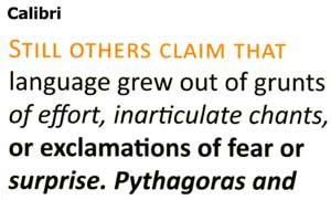
Calibri Font. (Photo: Microsoft) |
Bill Gates, the chairman of the American software giant, wanted everyone to feel more comfortable using computers, which is why improving document readability on screens was one of his top five priorities. Since early 2006, Microsoft announced it would ship its operating system and other software products with six specially designed typefaces intended for computer-generated documents.
Experts developing the MS Office suite favored sans-serif fonts like Calibri and chose it as the default font in Office 2007, replacing Times New Roman.
Calibri features softly rounded corners and conveys a lighter, more approachable feel compared to fonts like Arial or Helvetica. Lucas de Groot, the designer of Calibri, remarked: “The symmetry of this typeface is very suitable for emails, web design, magazines, and general documents, whether used in large or small sizes, or in regular, bold, or italic forms“.
Among the other five fonts, Cambria appears quite sturdy and strong, while Candara does not evoke a sense of flexibility, and Consolas is monotonous, similar to the Courier font, mainly used in programming environments to reduce eye strain for professionals.
 |
|
Consolas Font. (Photo: Microsoft) |
Meanwhile, Constantia is praised for its elegance and clarity. “Until now, users have often been dissatisfied when using the same font for both screen reading and print. Constantia will eliminate that drawback“, designer John Hudson affirmed. The final font among the six new typefaces, Corbel, is described by expert Jeremy Tankard as “uncluttered, very clear, and assertive“, promising to be a perfect alternative to Arial, Trebuchet, or Verdana.
P.T.


