In reality, the creation of the logo and name Apple is much simpler than the theories proposed by “the internet community.”
Apple is one of the most recognizable brands, with a highly identifiable “bitten apple logo.”
Since its founding in 1976 by Steve Jobs, Steve Wozniak, and Ronald Wayne, Apple has made several adjustments to its logo. However, the most significant change occurred only once after the company’s establishment.
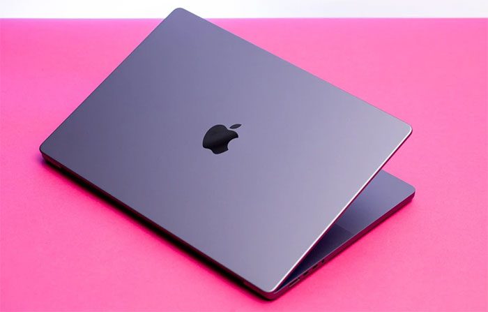
Apple logo on a MacBook. (Photo: The Verge).
Despite its simplicity and easy recognition, the reasons behind Apple’s choice of the “bitten apple” symbol are quite complex, ranging from scientific philosophy and Steve Jobs’ dietary habits to unclear origin theories. Nonetheless, most stories surrounding the Apple logo are inaccurate.
The First Logo of Apple
The apple appears in many historical anecdotes, including the “forbidden fruit” that Eve shared with Adam in the Bible, as well as Isaac Newton’s law of universal gravitation. However, the first logo of Apple did not feature just an apple.
According to Android Authority, the original Apple logo depicted Newton sitting under a tree, with an apple hanging from a branch. The text “Apple Computer Co.” was inscribed on the ribbon surrounding the frame.
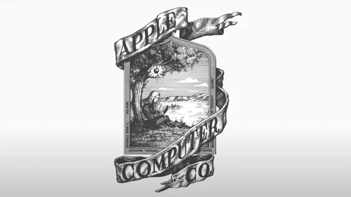
The first logo of Apple. (Photo: AppleInsider).
Upon closer inspection, the frame of the logo also includes an excerpt from William Wordsworth’s poem The Prelude: “Newton… a mind forever voyaging through strange seas of thought… Alone”.
The design of the logo appears outdated, even by 1970s standards. Therefore, it is not surprising that Apple quickly changed its logo.
The Bite and 6 Color Stripes
In 1977, Jobs hired designer Rob Janoff to create a new logo for Apple. This version featured the apple symbol with a bite taken out of it.
Unlike today’s Apple logo, this first bitten apple logo had multiple colors divided into 6 horizontal stripes, with the top green stripe representing the stem.
Many theories suggest that the stripes on the Apple logo symbolize support for the LGBTQ+ community, while the bite represents homage to Alan Turing – considered the father of modern computing. He was found dead from cyanide poisoning, with a bitten apple lying beside him.
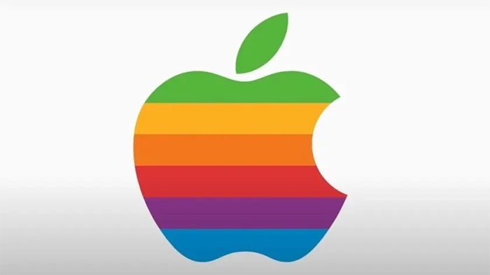
The “bitten apple” logo with 6 colors. (Photo: AppleInsider).
However, in a 2009 interview, Janoff denied the theory that the bite on the logo was related to Turing. Instead, the 6 stripes actually represent the color display of the Apple II computer.
The “bitten apple” logo with 6 colors remained in use by Apple for the next 20 years until Jobs returned and changed the symbol to a monochromatic black in 1998.
Other theories suggest that the Apple logo has roots in Greek mythology, referencing the Garden of the Hesperides or the orchard of Hera, which was believed to grow golden apples that grant immortality. However, no Apple representative has confirmed these “legends.”
The Reason Behind the Name Apple
Many theories state that the name Apple was chosen by Steve Jobs and Steve Wozniak to appear before Atari in the phone book. However, the real reason is much simpler.
In an interview during a press conference in 1981, Jobs confirmed that he chose the name Apple because he liked eating apples. At that time, Jobs was on a fruitarian diet and chose the name Apple after visiting an apple orchard.
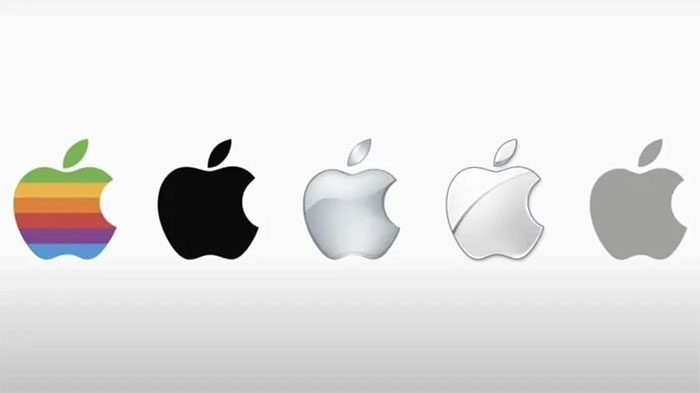
Different versions of the “bitten apple” logo. (Photo: AppleInsider).
“I love apples and enjoy eating them. However, the main idea behind Apple is to bring simplicity to the public in the most sophisticated way, that’s all,” Jobs said.
Regarding the bite on the logo, Janoff explained that this detail was meant to distinguish it as an apple rather than another fruit.
He also pointed out the coincidence that the word “bite” sounds similar to “byte” in computing. The bite in the logo also aligns perfectly with the letter “a” in “apple” when the brand name appears alongside the symbol for a brief period.


